I thought these collages were really cool, using vintage photographs and photos of nature. I especially like the contrast between the colorful images of nature and the black and white.
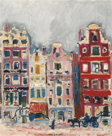 So I found this painting on Tumblr actually, and found out it's Maisons a Amsterdam by Kees van Dongen. I looked at a bit more of his work and I'm not a huge huge fan of his portraits but I really like this piece in particular. It's so gestural and the textures and colors are amazing!!
Okay, so the first exhibition I went to visit, was at visarts with the class. I really liked how the metal was manipulated in a way that it almost looked like duct tape. The second was at the Reynolds Gallery. I was really inspired by the marbled paintings of Heidi Trepainer. I actually went there though to look at some of Sally Mann's works before her reading of her book at the VMFA. She talked a lot about her relationship with Cy Twombly who I love love love so that was really cool.
Honestly, I liked it a lot better at the beginning.
The thing that I find most effective about protest art is it's simplicity, and easy-to-understand nature. Protest art is accessible to everyone, everywhere. It is not something that is usually put up in a gallery or museum initially, but in public places, meant to be seen. Its meant to be quick and to the point, and aesthetically pleasing. People are more likely to remember and pay attention to a piece of protest art which can be more dramatic and more effective than, say, a long paper which can easily bore readers.
Protest art may have more of a peaceful impact than some more traditional "protests" and rallies which can easily become chaotic. One of the examples in the first reading were the giant, inflatable cobblestones. They were juxtaposed against the violence of the protest and actually protected the protestors. The main goal of protest art is to create impact, which it does as it tends to be blunt, and to the point. It is meant to shock people in a way that they won't forget, which will encourage them to make a difference, or follow the ideas of those who are making the art. Coming into art 4, I always drew neat, tight, realistic figure drawings, but I never really liked them. I have always preferred looser, more gestural drawings that I couldn't do. This is why I chose Degas for my old master drawing. Coach was surprised that I chose somethings so different from my own personal mark, but that is exactly why I chose it. It was a challenge, and took some getting used to. At first, I focused on getting specific lines, but that's not the point. The point is to get the idea of the form and the shadows and the shapes, not specific details. Now my mark is a lot looser and more gestural like I wanted. It is a lot more dynamic and overall more interesting to look at. I can do this while looking at a figure or an object, but what I'm working on now is being able to do more art just from my brain without looking at a subject. That is what I've been working on especially with my bedsheets and some of the home projects, is making good art straight from my mind and not always looking at a photo, model, still life, etc. I've especially enjoyed the more independent projects like the fantastic four, place project and abstract impressionism. All three have given me opportunities to do whatever I want, and for all of them I've been drawn to painting. I'd love to work in paint, but also incorporate some unconventional materials as well. Through all of these projects, however different they may be, I think I've learned a lot more about what I enjoy and my personal style as an artist.
So six of my friends and I rented a van and all headed into DC last Saturday for my friend Ellie's birthday. We first went to the Hirshorn, which along with the contemporary gallery in the portrait gallery, is one of my favorite museums in DC. I love contemporary art, it is my favorite. Downstairs there was this fluorescent light room which was really really cool and turned my pink and green dress into grey and orange (black/blue vs. gold/white pt. 2??.) Upstairs, I was really happy to see a Mark Rothko, and then the Janet Anini heads! I was able to give all of my friends a little art history lesson about her which they thought were really cool. After buying matching onesies, we also decided to stop by Daniel Chester French's Lincoln Memorial.
My mother has had two Colleen Ross prints for as long as I've ever known. I don't know where she got them, but when we moved I got to put one of them in my room. I absolutely love her use of color. It sort of reminds me of impressionism where the closer you get up, a normal skin tone may have dozens of colors within it. I also explored her instagram with some of her newer work on it.
|
