I've always loved collage, but I was quite enamored with these by Tess Johnson. I love the use of unconventional backgrounds like notebook paper, and the juxtaposition of color against black and white photography.
|
We've talked a lot recently about America, and Americana, and the portrayal of both of those things in art, first with Winslow Homer, and then with Daniel Chester French and his Lincoln Memorial. Winslow Homer, although referred to by many as one of America's greatest painters is relatively unknown. His style is described as Americana. This brought up the question of what is Americana. America has no Golden Age, other than that of Hollywood, and many American icons come out of this period. However, our nation is so young that we do not have much of a classical period, and many of our traditions are from a melting pot of other cultures.
This was another problem when Daniel Chester French made his statue of Abraham Lincoln. The statue would have been completely different if Lincoln was portrayed in, say, a toga and laurels like the sculpture of George Washington by Horatio Greenough. Other ideas for the statue, like a pyramid, wouldn't have fit very well with the surrounding capital city of Washington, D.C. The other problem concerned the placement of this statue. Would it have the same meaning if it was put somewhere else? Gettysburg was an idea. This huge marble statue, however, would probably seem out of place in Gettysburg. Would French have changed the statue to fit it's surroundings? Gettysburg is an important place for Lincoln, but by putting him in D.C with Washington, and Jefferson, he is among the greats, for millions of people to see. This is The Postcard Project by Mark Hall-Patch. It was made as an advent calendar for a friend. He used india ink and drew these lovely little pen and inks on the back of post cards of Canada. It was especially inspiring to me because of an upcoming 5 week trip to Germany where I plan on doing something similar.
I got tickets to finding Vivian Maier at the Byrd Theatre. It is a documentary about a woman, Vivian Maier, and her photography from the 50's-80's that was recently discovered. There were thousands of rolls of undeveloped film that were discovered. She was a wonderful artist that nobody knew about until now. She was an absolute mystery. She is known for her street photography of New York and Chicago.
Learn more here. I love these pieces by artist Oriol Angril Jordà. They give the illusion of a double exposure photograph with only watercolor and pencil. I also love the use of unnatural, rainbow colors in the figure drawings.
See more work here. So since we're kinda between projects at the moment, I thought I'd put up pics of my home project, and also a random painting I did on one of our snow days. I started my place project a couple weeks ago when I was home sick. I wanted to work really large scale so I got the idea of using a bedsheets as a canvas. I began by almost dying the fabric with a really watered down mauve color (I was limited on paint,) and a sponge randomly. I ran out of this color, and then just filled the rest of the white with the pinky color. I really enjoyed the abstract impressionism project, so I was planning on doing this abstract as well. I was planning on doing these overlapping triangle things almost like leaves, but after two or so I realized they kinda look like mountains. I spent my winter break in Breckenridge, CO so that quickly became the inspiration for my place project.
The second piece is a painting I did of the first night it snowed where everything was tinted an orangey apricot color, and I thought it looked neat so I painted it. Here is a compilation of all the steps in my abstract expressionism piece. This is by far my favorite project we've done this year. I love the freedom it gives you todo whatever you want, and you don't have to worry about making something look exactly like what it's supposed to be. The hardest part for me was not wanting to cover things up, but I think in the end I came up with a good balance of doing enough but still retaining some of the original elements. I like how even after all these layers I have some of the raw canvas showing through. I think this is what I want to do next year in art 4, because I'm already coming up with ideas of more and more things to paint.
I began with this light blue color, but with a tad bit of green so it was brighter, but still a blue. I mixed it with the gloss medium and a bunch of water. I started at the top and just let it drip, then I did another layer and another until I got down to the bottom. I made such a mess, but it was such a great feeling to have such a great big canvas like this and let all of it drip everywhere. Next, I mixed a pale sunshine-y yellow with some gold and white, and followed the forms made at the top of the blue almost like sunshine on the top of clouds. This color also had some of the gloss medium. Actually, all of my colors had that mixed into them. I love how it gave everything a shiny, transparent quality. It gave texture without me using joint compound or gesso or anything like that. Next, I mixed a pink, and did almost the opposite of the yellow on the middle of the blue stripes. I used the nuances in the blue color to make shapes, but instead of outlining them I filled them in. I did the same with a lighter pink more towards the bottom, and a red at the top, so the blobs fade towards the bottom. Next was the squiggles. This was the hardest part for me. I knew that I wanted to use a beige/nude color, but I didn't know exactly what to do with it. First of all, I mixed the color a bit too dark and it ended up being more peachy than I wanted. Also, I should have waited because I just went for it on the canvas. Looking back, I probably should have been a bit more thoughtful and come up with something better to do. Anywhoo I ended up with these worm things. While I was thinking about how to somehow salvage these worm things. I went back on the drips and added little shiny black dots with the end of a paintbrush. Coach Hall then came up with the idea of going over the squiggles with some joint compound and white to lighten up the darkest parts. After doing that for a bit, I kinda went crazy and did it over all the squiggles, and added layer over layer until each worm had a almost translucent veil over it. It still doesn't work great with the rest of the piece, but I feel like I resolved it well. I'm pretty happy with it being my first time ever doing abstraction, and I know that the more I do it, the better and better it will be. 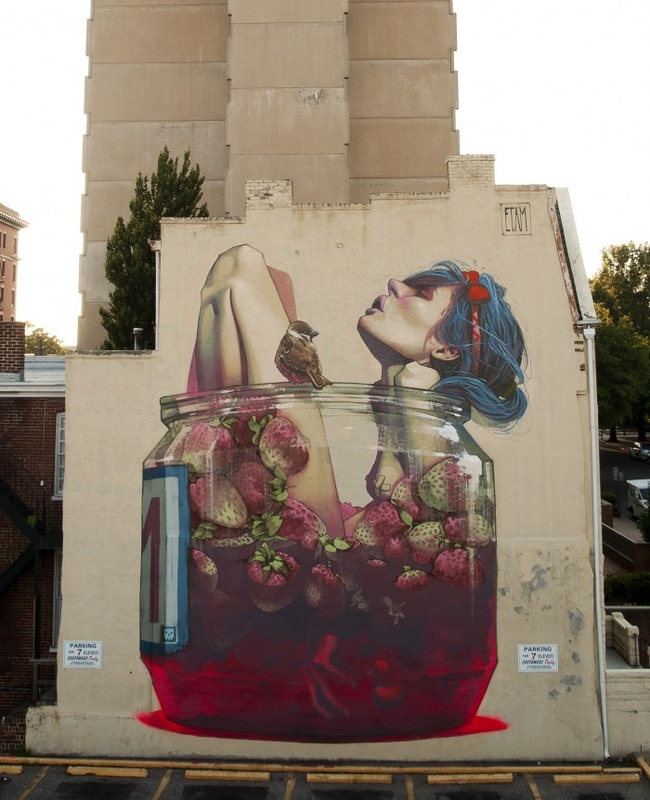
I drive past this mural maybe once a month. I've always loved it. After a bit of research I found out it was painted by a muralist duo called Etam Cru. It is called "moonshine." I love the color combinations, and basically just the vibe you get from it.
http://www.etamcru.com One of the main arguments that comes up in practically every reading/discussion involving art is the definition of art. This time another layer of complication with the purpose of the art. What is art made for, and does the purpose tamper the meaning of the art? This specifically came up with the use of propaganda. Does the fact that this art was made to sway someones opinion, make it not art, but merely advertisement. Also, where is art made to go? Is it made to be hung up in a house, to be shown in a gallery or in public? Artists like Ai Wei Wei specifically display their artwork in public places as a message. Does this make his work propaganda?
In connection to the actual article, specifically. These pieces being used as propaganda were made by the artist, but then used by the government for a different purpose. The question is, who started the movement? Was it the artist or the government? I think it depends on how the artist and the governments motives align. I believe the government started the movement itself, but it wouldn't have been made possible without the artist making the work. Another discussion brought up by this article was the comparison of classical art and more contemporary abstraction or non-objective art. Personally, I prefer more contemporary art, because it is more interesting. The focus is not to depict a figure as accurately as possible, it is to portray a feeling or message. It is harder to figure out, which makes it more interesting. Art like this seems to fit my definition of art more actually, because I believe art is a lot more about the meaning and the creativity and process put into the art than the appearance itself. This is one of the things I enjoy most about the abstract impressionist pieces. They are so much more about the creativity, process, and meaning than anything else. One of my favorite field trips of the year… always a ton of memories. Started out at the Hirshorn with some really trippy videos, and these hanging foam filled things. Next, the National Art Gallery. We stayed in the West Wing for our assignment, kinda disappointing to me because I prefer contemporary art. I do like French Impressionism though, and we did see a lot of that. Afterward we went to the portrait gallery where we saw the Gilbert Stuart Washington's, but spent most of our time in the 4th floor where the contemporary art was. Those were my favorite! They had some artists I recognized, and I took a few pictures until my phone died. Last but not least we rode the merry go round! (It's a tradition.)
|
